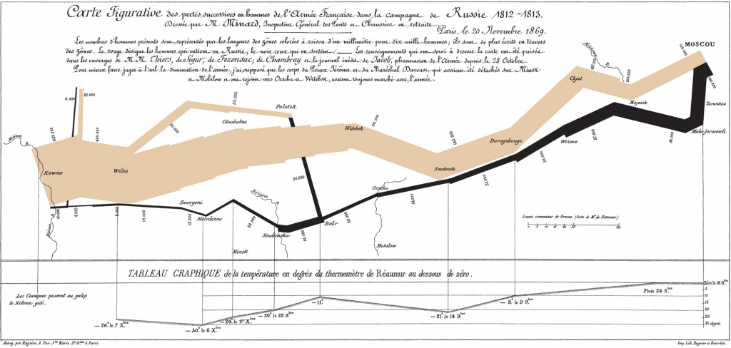
Data map designed by Charles Minard. Source: Wikipedia.
Although data scientist Edward Tufte is often credited with pioneering the field of data visualization (he’s been called “the Leonardo da Vinci of Data”), he’s quick to point out that his craft is not actually new. At Tufte’s one-day course last month, I saw first-hand how historians, statisticians and artists have been creating information visualizations (aka. analytical designs) for centuries, even dating back to Galileo’s 1610 celestial manuscripts.
Of special interest to Tufte is Charles Minard’s 1869 data map illustrating the losses of the French army during Napoleon’s invasion of Russia in the War of 1812 (not to be confused with our War of 1812). Considered one of the best statistical graphics ever, Minard combines rich historical content and brilliant design to tell this story through five variables:
- The size of the French army
- The army’s two-dimensional location
- The direction of the army’s movement
- The temperature during the retreat from Moscow
- The dates of the retreat from Moscow
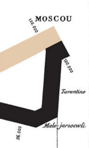
Close-up of reversal of Napoleon’s army at Moscow.
The infographic is worth a long look, but for those in a hurry, here’s a quick read:
- Beginning at the left of the chart, on the Russian border near the Niemen River, the thick tan line shows the size of the French Army (422,000) as it invaded Russia in June 1812.
- As French forces die in battle, the line narrows to show the number of remaining soldiers at each location.
- In September 1812, the 100,000 surviving troops reached Moscow, where they were turned back by Russian forces (in a battle that inspired Tchaikovsky’s “1812 Overture”).
- The departure from Moscow is depicted by the dark lower line. A temperature and date scale at the bottom of the chart shows the frigid weather that contributed to French losses during the retreat.
- In December 1812, Napoleon’s army crosses back over the Niemen River with just 10,000 survivors.
As Tufte puts it, Minard’s map conveys “unfathomable loss with brutal eloquence” and, in doing so, exemplifies his six fundamental principles of analytical design:
- Show causality: Scientific research of all kinds is based on identifying causality, a.k.a. figuring out why something happened. As such, any good graphic should indicate a cause-and-effect, which Minard’s map does by illustrating the role of temperature in the deaths of French forces.
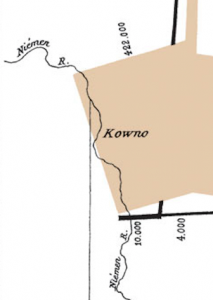
Close-up of beginning and end of Napoleon’s Russian campaign.
- Show comparisons and differences: The most important question in statistical reasoning is “Compared to what?” Good data (and visualizations) should make intelligent and appropriate comparisons, be it against past, average, or goal numbers. Minard does this by contrasting the size of the French army at the beginning and end of the Russian campaign.
- Show multivariate data: The real world is multivariate (involving many variables in a given situation), but too often data displays are single variable, providing little context or broader meaning. Visualizations should offer the reader more than one or two variables to enrich the story the graphic tells (Minard’s data-map uses five).
- Completely integrate evidence: Evidence (including words, numbers, images, and diagrams) should work together to tell one story simultaneously. Relevant text should be situated near its respective images and charts, not segregated and appended by mode (as is the case with many statistical papers and reports).
- Thoroughly describe the evidence: Establish the credibility of your evidence by providing key information: A detailed title, authors and sponsors, data sources, complete measurement scales, and any relevant issues.
- Content counts most of all: As Tufte says, “Analytical presentations stand or fall depending on the quality, relevance, and integrity of their content.” Minard’s data map is fueled by his passionate opposition to war: The content is rich with personal interest and understanding, and therefor more compelling and relevant.
Analytical design is important to every industry and discipline, and is regularly used by the Delucchi Plus Strategy & Insights team to convey the results of marketing research exercises or campaigns. Thankfully, our projects have lower stakes than war and peace, but we nonetheless strive to instill Tufte’s six principles into how we represent information.


Posted By
Categories
Plus Points, Research