
While redesigning an old website for a client, I noticed how dated the social media icons were in the footer. Nothing says “This site was designed in 2011” like the old Twitter “t” in a rounded rectangle (nevermind that Twitter actually never used that as their logo). As I often have to update social icons on older sites, I started to wonder why I had to go through this exercise so often.
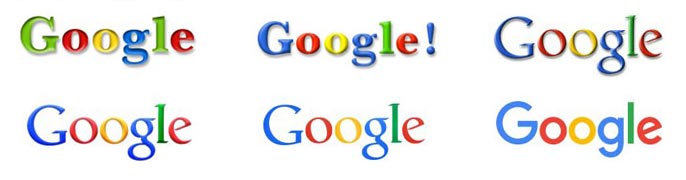
Everyone is familiar with Google’s most recent re-brand, but it has actually changed its logo 6! times since its inception in 1998. Within the past three years, some of the internet’s most popular companies (Facebook, Twitter, Uber, Spotify, and Airbnb) have all undergone significant new branding exercises and have changed their logos. Most of these companies haven’t existed for more than eight or nine years, and they’re already on their second or third logo.
Meanwhile, other globally recognized brands with some semblance of permanence (Apple, Coca Cola, McDonald’s, IBM, GE, Disney, BMW, Nike) haven’t changed their logo for decades. So why is it so many companies that found their genesis online feel the need to change their logos so often?
How often does Facebook change it’s feed or features? How many times have you been asked to restart Spotify to make the new version yours? These companies’ cultures are steeped in environments of constant iteration, and this could extend to how these companies view their visual identity. Their products, audiences, even their business plans, are constantly being tweaked in response to user feedback and data; why not their branding?
For a company like Subway to completely rebrand itself, road signage, exterior signage, in-store signage, bags, menus all have to be updated… FOR OVER 30,000 STORES. This is a herculean effort that would likely take years and tens of millions of dollars. For Google to change their logo, the process could be as simple as replacing a single image file on a server. With many of these online companies, there is a lack of hard costs in the production of physical goods that could serve as a barrier to change.
If the perception is that a company is old, stagnating, or not current, the threat of users leaving one application for another grows. Success is always fleeting, but even if your product isn’t truly new, new logos and updated branding make everything feel new.
Also, it is actually hard to create elegant, timeless, and meaningful logos that look at home in any era. It is however, fairly easy to glom on to the trend du jour, whether it be the late 90s oval enclosure, the 2000s’ high gloss finish or today’s “flat” style ushered in by iOS7 and Google’s Material design. In addition, many of these companies don’t have physical products that sit on shelves, they have apps that sit on your phone. If a logo or app icon feels dated in light of an updated OS or the icons around it, there may be pressure to change so as not to appear behind the times.

Posted By
Lance Hayden
Categories
Design, Plus Points