The term “kerning” refers to adjusting the space between two letters.
Making many recent headlines, Esurance has shown us just how important kerning can be. Multiple billboards were placed around Chicago with quite an eye-catching message for viewers…well, depending on how you look at it. Innocently enough, the auto insurance provider was attempting to convey the message “cover your home in a click,” which from a few hundred feet away appeared to be a much more offensive statement. From a distance, or from certain angles, the “c” and “l” blur together making it appear as…I think you get the picture. Needless to say all these billboards were quickly pulled, making this a costly mistake for the auto insurance company.
The lesson to be learned here? Never underestimate the importance of diverse view points — and, more pointedly, make sure to review your billboard from a few hundred feet and every vantage point before putting it up all over town.
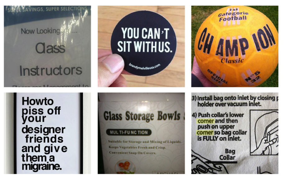
Esurance isn’t the only offender. Check out these other examples of kerning gone wrong, compiled by Inspirationfeed:
 (Upper photo credit: Esurance via Deadspin)
Posted By
Categories
Plus Points
Tags
design, Esurance, Graphic Design, Kerning