Photo Credit: Miller Lite Facebook Page
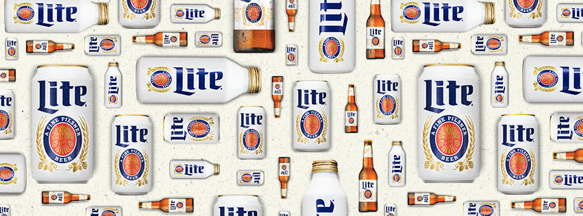
Earlier this year I posted about how Miller Lite was going retro with their packaging. At the time they were planning on a short three month feature of the classic “Lite” on white design. This was a tip of the hat to the brand’s nearly 40 year history, and as summer wore on, the affinity for the classic can design grew and sales immediately increased. Miller Lite traditionalists, rejoice!
Miller Lite expand its retro design to aluminum pints, glass bottles and tap handles. The design jumps out on store shelves next to the sea of metallic blues, and reds commonly associated with American domestics (we’re looking at you, Bud Light).
The label change tactic worked and looks like it is here to stay. It goes to show how the perception of a product can be changed based on how it is packaged. Miller Lite isn’t the first brand to tap into nostalgic packaging of yore to reinforce brand loyalty. From football teams bringing back the jerseys of 20 years ago to retro packaging for Coke and Miller Lite products, it looks like harking back to yesterday is a successful tactic for many brands!

Posted By
Ryan Strohl
Categories
Plus Points